Review Analytics Dashboards
About Analytics and Reporting
Connectbase takes pride in providing state of the art solutions for its customers in the telecommunication industry. The Connected World (TCW) platform is the industry standard for buying and selling connectivity. Keeping in view the dynamically changing business requirements and the importance of the real time analytics for quick decision making, Connectbase is introducing a new feature, Connectbase Analytics, into the platform.
The Connectbase Analytics Reporting tool is a subscription only feature that must be enabled within your company instance for access. Using the data within the platform, it enables you to view dashboard visuals based on your instance data for quick decision making and monitoring of key indicators. In this initial release, Connectbase provides you with a fixed/static reports dashboard; however, in the next phase, we will introduce additional features that will enable you to build your own customized reports and add them to your personal dashboards.
Following are conceptual frameworks of Seller and Buyer Dashboards.
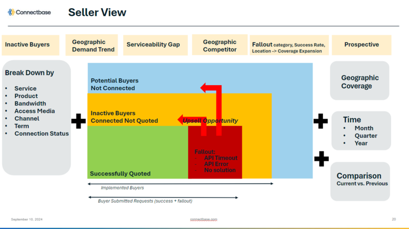 |
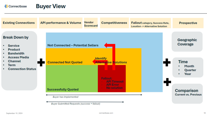 |
Subscription
Connectbase Analytics is a subscription only feature. Please contact your Customer Success Manager to activate your subscription. If you require technical assistance or wish to report an issue to the Connectbase Support team, please log into the Connectbase Customer Support Desk Portal at https://support.connectbase.com and submit a support ticket.
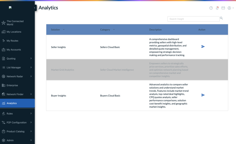
This section provides an overview of Connectbase analytics dashboard. Landing page of the analytics dashboard displays the list of available dashboard, with the active links depending on your subscription level. The dashboard is categorized by seller and buyer reports. If you don't see your subscribed dashboard on the analytics landing page, contact your customer success manager or Connectbase Customer Support team.
Buyer insights provides the following reports to view and export analytics data:
Overview
Quote Details
Quote Solutions Export
Seller Pricing Metrics
Seller Score Card
Fallout Suggestion
Potential Sellers
Click the required report to access the relevant visuals and/or export analytical data.
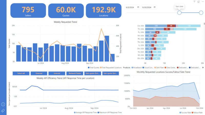
Overview provides following KPI visuals:
Total Requested Locations/ Quotes / Sellers Engaged
Weekly trend line of total requested locations vs. total quotes
Weekly trend line of API efficiency
Price engine source percentage pie chart with fallout rate
Following is an example of Buyer Dashboard Overview:
 |
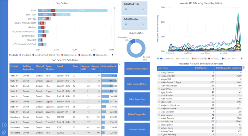
Quote Details provides the following visuals:
Top sellers based on total requested locations
Top rated solutions based on solution counts
User quote workflow status with counts
Quote status (CPQ API based) in a donut chart
Following is an example of Quote Detail visuals:
 |
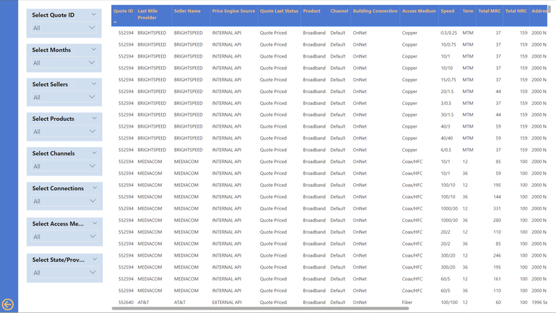
The reports provides the data as below:
Grid view of requested locations
Available filters: quote ID, month, seller, product, channel, connection status, access medium, state/province
You can use the appropriate filters to select the required data and click on Export button on top of the visual to export the data in Excel/PDF format as required. As example of "Quote solutions Export"is given below:
 |
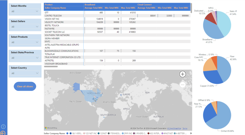
Seller Pricing Metrics report provides the following KPI details:
Price metrics based on sellers divided by products
Geographic pie chart view
Able to filter based on month, seller, product, state, country
Following is an example of the Seller Pricing Metrics report:
 |
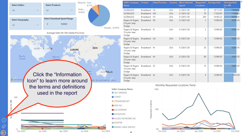
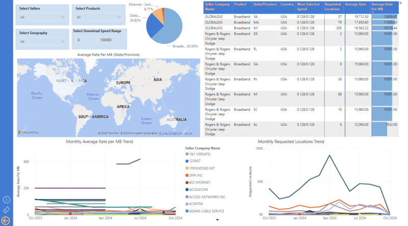
Seller Score Card report provides the following KPI visuals:
Average Rate Per Mb (State/Providence)
Monthly Average Rate per MB Trend
Monthly Requested Locations Trend
Grid view of seller name, product, state/providence, country, most selected speed, requested locations, average rate, average rate per Mb
Following figure shows an example of Seller Score Card:
 |
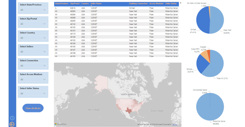
Fallout Suggestion includes the following metrics:
Ability to filter by state/providence, country, seller name, connection status, access medium, seller connection status
A grid view of fallout details
A pie chart of connected sellers vs. potential sellers
A geospatial distribution of serviceability fallout sites per state
Following figure shows an example of Fallout Suggestion report:
 |
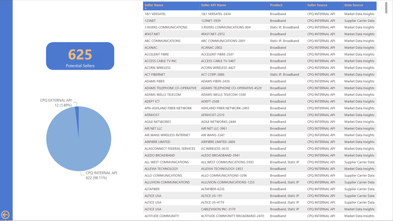
Potential Sellers provides following data points:
Total counts of potential sellers
Potential seller source percentage pie chart
Potential seller details
Seller, API name, product, seller source, data source
Below is an example of "Potential Sellers" report:
 |
The Market Grid tool can be used to gain market insights of your potential markets and competitiveness across your entire company footprint. Subscribed users can see a visual representation of their market demand based on their OnNet building footprint in The Connected World, summarized with a “Grid Fit Score” to indicate potential return on investment and to aid in market planning decisions.
Note
The Market Grid is an instance level enablement that must be set by an internal Connectbase Administrator. If you need assistance, please contact your Customer Success Manager.
To use the Market Grid:
Click tab. from the navigation sidebar.
Click
 from the map page.
Navigate to tab
Result: Default view is set to the Grid Fit Score. To view other data, select the drop-down and choose an option.
Note
If the Grid function is not displayed within the Markets tab, your instance may not be enabled for this feature. If your instance is not enabled, contact Connectbase Customer Support for the appropriate user permissions.
The Grid is color coded by the Grid fit score; the higher the score the denser the blue appears in color. To see the following data, hover over the individual grid squares:
Data Type | Description |
|---|---|
City | City where the grid is located. |
Total number of locations | Number of locations including both non-residential and residential within the grid. |
Average Telecom spend | The average network spending in the grid based on non-residential locations. |
Unique provider count | Number of network providers in the grid. |
Top market share network providers | The top three market share providers in the grid. |
Provider market share | How much of the provider location is OnNet in the instance versus the total number of locations. |
Number of OnNet locations | Number of locations that are OnNet. |
Average Build Distance (FT) | The average distance of the number of locations you do not service within the grid. Measured in feet. |
Grid Fit Score | A score that measures the return on investment and is based on how much of the addressable market you can connect to divided by average build distance. The higher the score the higher the return on investment. |
Seller insights provides the following reports to view and export analytics data:
Overview
Geospatial Map View
Buyer Details
Buyer Detail Export
Quote Detail Export
Potential Buyer
Inactive Buyer
Click the required report to access the relevant visuals and/or export analytical data.
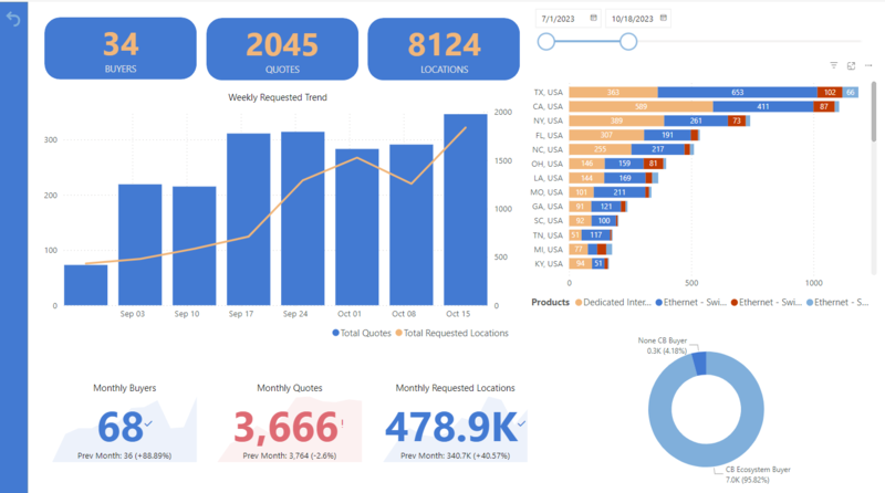
The report includes following major KPI:
Total Requested Locations/ Quotes / Buyers Engaged
Weekly Quote Locations Trend Line
KPI Cards
KPI Percentage Donut Chart
Requested locations break down by state/providence and products
Buyer Connection Source Donut Chart
An example of the "Overview" report is given below:
 |
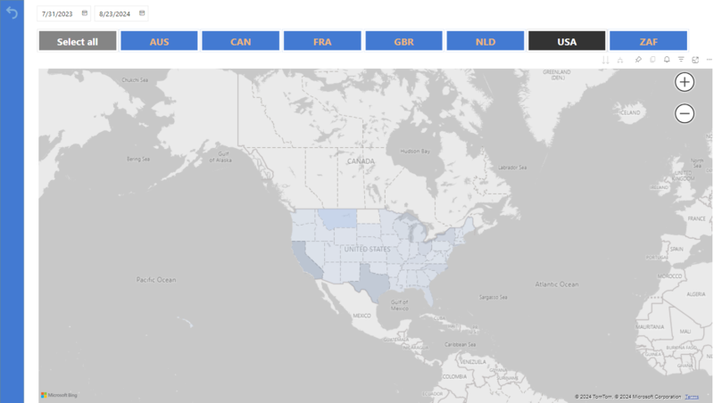
Geospatial Demand Mapping (by country, state) provides the requested locations counts and admin boundary name as shown in the below example:.
 |
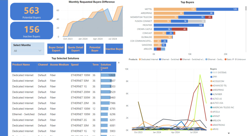
Buyer Details provides following KPIs:
Monthly Requests Difference
Potential Buyers Counts
Inactive Buyers Counts
Top Buyer Lists
Top Selected Solutions
Buyer Demands Trend Line by month
Following is an example of "Buyer Detail"report:
 |
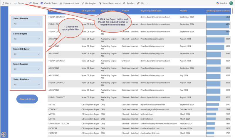
Buyer Detail Export provides data in a grid view along with the flexibility of exporting the data to an Excel file with selected filters. You can also user the filters to customise the report view and export the intended data. Following is an example of "Buyer Detail Export" report:
 |
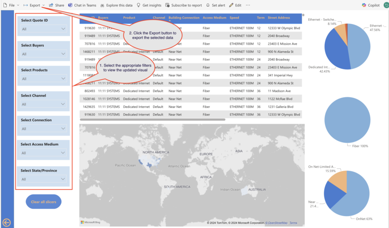
This report provides the data in a grid view with the ability to select multiple filters to narrow down the data analysis. You can filter the data to see the updated visual and can export the selected data by clicking on the export button as shown in the example:
 |
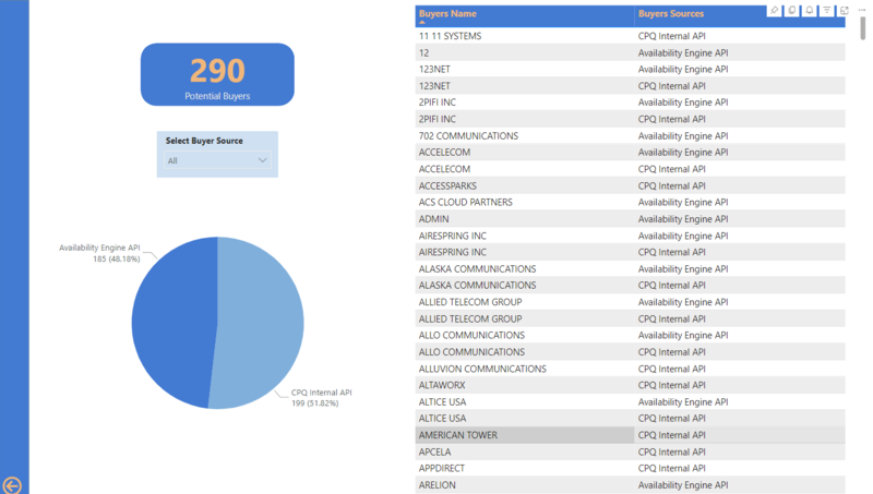
Potential Buyer report provides the following KPIs:
Total Counts
Available Connection Methods
Availability Engine API from MasterStream only, and CPQ Internal API
Business Partner Portal, Serviceability Portal are excluded
Buyer details in grid view
Following visual shows an example of "Potential Buyer"report:
 |
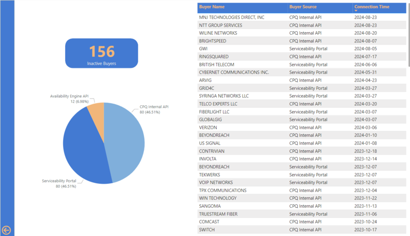
Report provids the visual and data for following KPIs:
Total Counts
Available Connection Method
Buyer details in a grid view
Following is an example of "Inactive Buyer" report.
 |

